
Leader
Summer 2022

Wassif is the in-house HTML developer working to create memorable customer emails. In this guest post he discusses how to make the most out of your emails when you don’t have an in-house HTML design team and the three principles he practices to keep email design quick but impactful.
An important aspect of providing truly tailored experiences for your customers is creating email templates. This aspect of campaign building is often dreaded as it’s time-consuming and poses a challenge when you have various regions and customer groups. For marketers with no in-house design team or siloed from that department, this additional step in creating campaigns can make the process of personalisation appear overwhelming. Being time-poor with targets to reach, making multiple versions of the same email isn’t at the top of most’s to do list. But with the right knowledge you can create easy-to-do but effective emails. This means you can can add to the customer experience without chasing down a team or making design common mistakes.
In this blog post, we take a look at the three most common design mistakes and share what you should be doing instead. Although templates may take time, with the ability to know how impactful the below changes are you can limit the time it takes to create them before taking things further and advancing the email itself. This will arm you with the foundation to a ‘good’ email.
There’s a fine line between good and bad email design. We know as marketers, you want to make sure you’re sharing as much content with customers as possible; especially during an age of so much option. However, brand is important and having an email that doesn’t reflect the overall brand and your noted style creates a disjointed experience for customers. For a seamless transition between email and website, here are some starting recommendations for designing your email:
The header is the first thing your customer will see. We recommend to keep the header area simple and clutter free. Usually this means having a logo and navigation area, this might also include ‘view in browser’ and pre-header links above the logo.
First impressions, especially if this is a new customer or subscriber, are important as the majority of emails are now opened on mobile devices. This means smaller screens but also less time to hold their attention before the reach for the next email. It should be clear how you’d like them to navigate through the email.
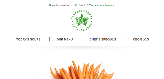
Once they reach the bottom the footer area should also be fairly simple and clutter free. We recommend having contact details, social icons, preference centre link, unsubscribe link and footer text here, which encourages customers to engage with you across all your available channels. For mobile we would recommend hiding the navigation completely or reducing it to 3 items. A great example is the introduction to a new Pret veggie menu in the email below:
As a marketer you want to share as much information as possible while you have your customer’s attention but emails that have a lot of content can be cut off by some email clients, most notably Gmail.
Gmail, alongside a few other providers, will cut any emails over 102KB and put a ‘view entire message’ link at the bottom; meaning our customer then needs to click on the link to view the whole email, disrupting the intended experience. This also has an impact on how your message renders, which means the format may change, leaving your email looking broken or outdated.
The 102KB is calculated based on the lines of HTML, images added to the template do not count towards the KB count as these are served from a URL and not directly imported into the template. But If this does occur, the best way to fix it is to reduce the amount of blocks/content in your template.
This Volkswagen email was intentionally overly long to demonstrate the distances its latest vehicle could travel. The email, although brilliant marketing, would be shortened by the email provider used.
As social media highlights, image often leads the way when it comes to engagement, so it can be tempting to fill your email to the brim with great lifestyle and hero images. But what if the images don’t come through instantly or at all? We recommend using as much live text as possible, to bolster your emails. Not only does this mean that you have an opportunity to further display the brand voice, there are 3 particular benefits to letting words lead the way:
People with visual impairments may use text-to-speech readers to help navigate through your website and emails. Although screen readers can read alt tags, using images alone can hinder the text-to-speech software and customers can miss out on important content, so you miss out on reaching an equally important customer This also impacts customer ability to increase their browser font-size for better readability. Leaving them more likely to click out of your email.
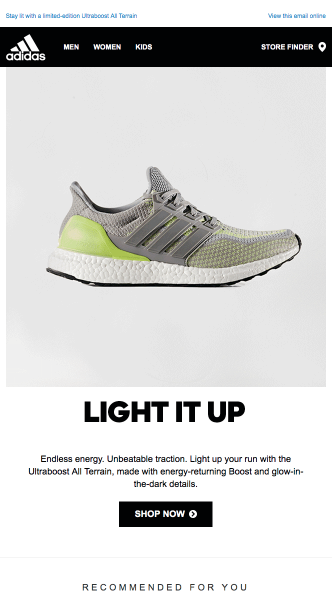
This example by sportswear giant Adidas, highlights how to showcase products and have imagery play a big role in marketing, without compromising great copy that can be used by those who are visually impaired.
Another benefit of using live text is that the text will auto adjust within a content area for mobile devices, ensuring it’s still easy to read. Images resize and scale on mobile, so any image with text may become a challenge to read when resized for mobile. A great work around for this is to have an image block which allows you to select a different image for desktop and a different image for mobile. However, this would mean that you need to make sure to create 2 versions of the image each time when adding the image block to your email.
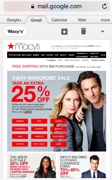
American department store favourite, Macy’s, illustrate how to showcase your sales offerings (and your product catalogue)
Using live text makes within your email templates makes it easier to update as and when you need to, and during seasonal periods, flash sales and aligning with a recent current event – this is the most time-saving method. Instead of having to rely on a designer to export a new image, you can update text in real time and adjust colours and sizing within the template.
Personalising emails can feel tough when it involves the time-consuming element of templates. Although they can’t be avoided, there are ways to make them more impactful with less heavy lifting on your side. Ensuring that your design is as aligned and visually appealing as possible means that you can keep customers engaged and match the expectations they have of your content. 3 things to avoid are:
Remembering these three design practices will help to create a strong foundation of a good email before you start adding advanced features.
Ometria is committed to protecting and respecting your privacy, and we’ll only use your personal information to administer your account and to provide the products and services you requested from us. You may unsubscribe from these communications at any time. For information on how to unsubscribe, as well as our privacy practices and commitment to protecting your privacy, please review our Privacy Policy.


Take the first step toward smarter customer marketing