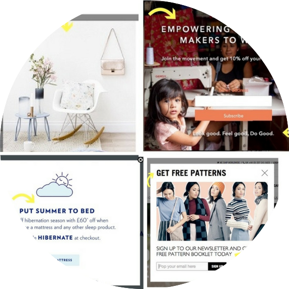
 Love them or hate them, when it comes to building your email database, popups are always part of the conversation.
We’re referring, of course, to the small windows that appear, unannounced, in front of a retailer’s page when you visit their site – stopping your from doing anything until you either: enter your email address, acknowledge their announcement or hit the cancel button.
Due to their interruptive nature, popups can be a source of anger or exasperation among online shoppers – especially those who are, let’s say, in a rush or trying to use their phone with one hand whilst carrying shopping with the other.
Because of this, popups can also be a source of anxiety for online retailers concerned about high bounce rates.
And yet, despite all this doom and gloom, research is continuously on popups’ side. For example, according to conversion optimization platform JustUno, health and lifestyle company SkinnyMe Tea managed to increase email opt ins by 758% after adding pop up promotions to their website in 2015.
This proves that popups can work; but how can ecommerce marketers make sure their own versions encourage browsers to buy not bounce?
By making them genuinely awesome.
For this blog post, we visited over 50 different ecommerce sites to see which brands are getting popups right. Listed below are our top nine, and why they made the cut.
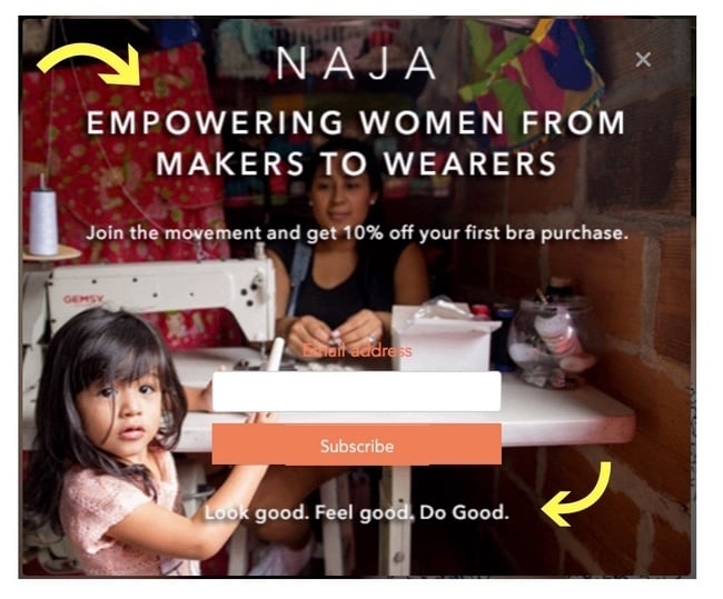
There’s much more to lingerie company Naja than beautiful underwear and bras. The brand aims to not only save the world’s seas with its eco-conscious garments, but also empower women not objectify them. In other words, Naja is as much an ecommerce store as a passion project.
Naja’s popup works because:
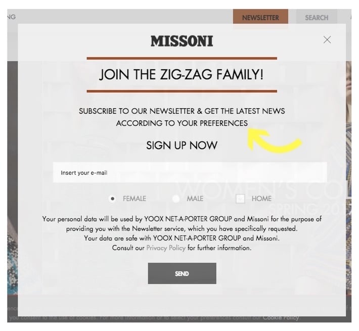
Founded by Ottavio and Rosita Missoni in Italy in 1953, Missoni started out as a knitwear label. Fastforward 63 years, and the brand is not just at the cutting edge of fashion but also ecommerce.
Missoni’s popup works because:
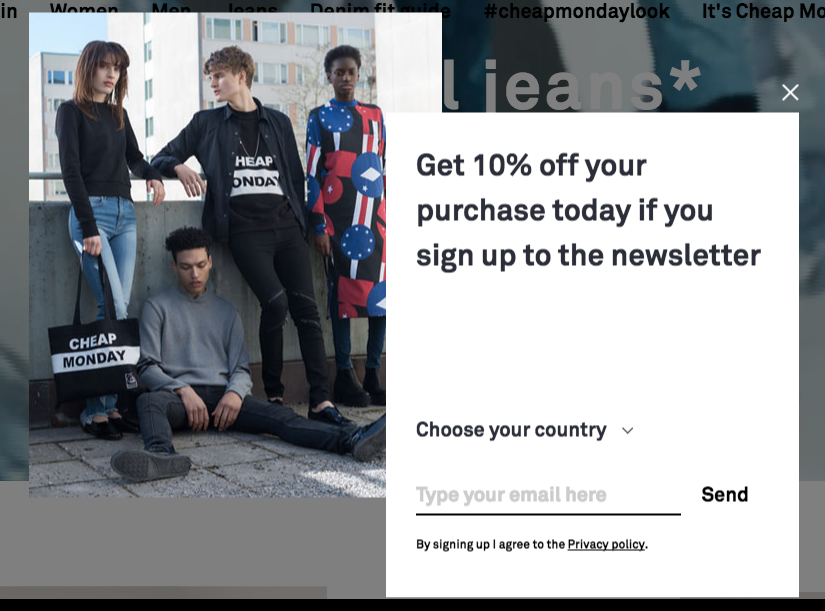
Founded as a small second hand store in Stockholm way back 2000, today Cheap Monday has stores in London, Beijing and Shenyang—and also happens to be home to a super arty ecommerce site.
Cheap Monday’s popup works because:
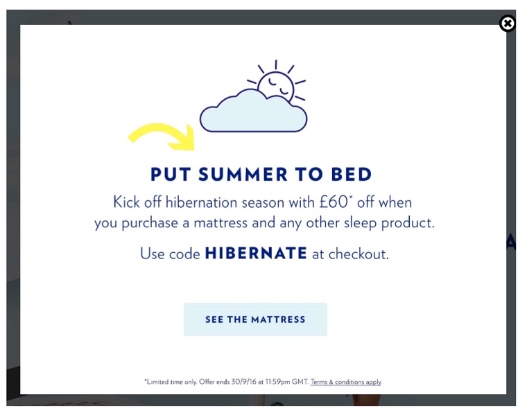
As we’ve pointed out in a previous blog post, mattress companies are a great source of inspiration when it comes to ecommerce marketing. It’s no surprise, then, that one of our popup finalists comes from sleep startup Casper.
Casper’s popup works because:
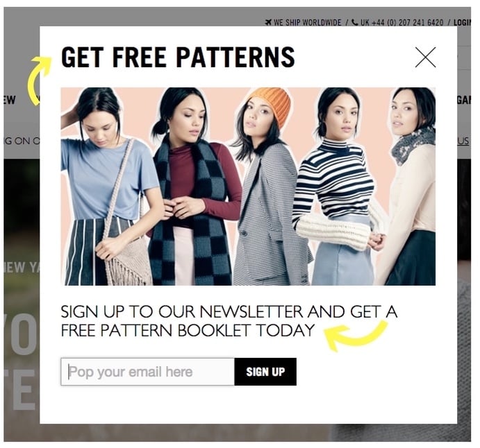
Powered by a community of knitters around the world, Wool and the Gang is all about unique, sustainable, handmade fashion that does away with mass production. Turns out, its ecommerce marketing reflects the same level of craftsmanship as its clothes.
Wool and the Gang’s popup works because:
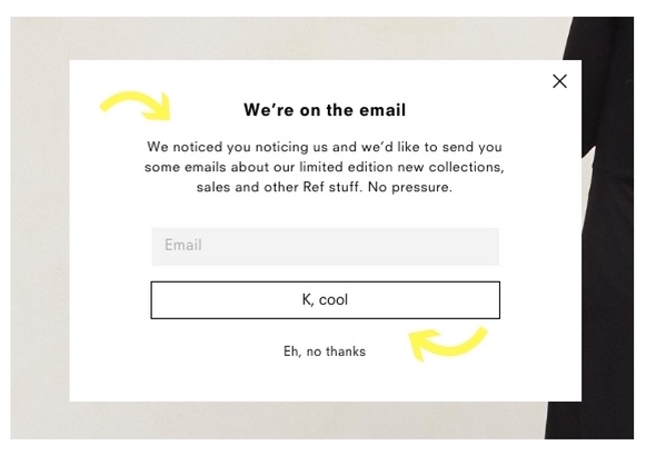
Reformation is another sustainable label, this time based in downtown Los Angeles. Established in 2009, the brand is on-point with its ecommerce marketing – from its dreamy about page on its website to its well-curated product pages.
Reformation’s popup works because:
{{cta(‘e359dff7-2caf-40d2-b17a-89835850fc87’)}}
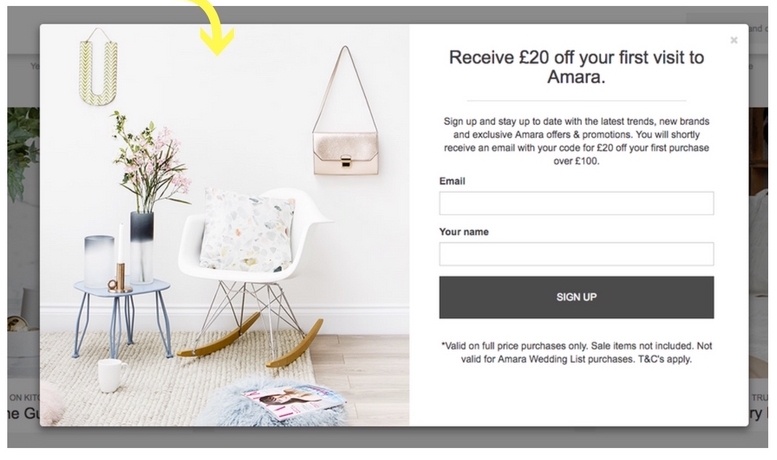
Hitherto this blog post has focused primarily on concept and content, but it’s no secret that one of the most important elements of an ecommerce popup is the design.
What better brand to celebrate for its aesthetic genius than the luxury gifts and designer homewear online store Amara.
Amara’s popup works because:
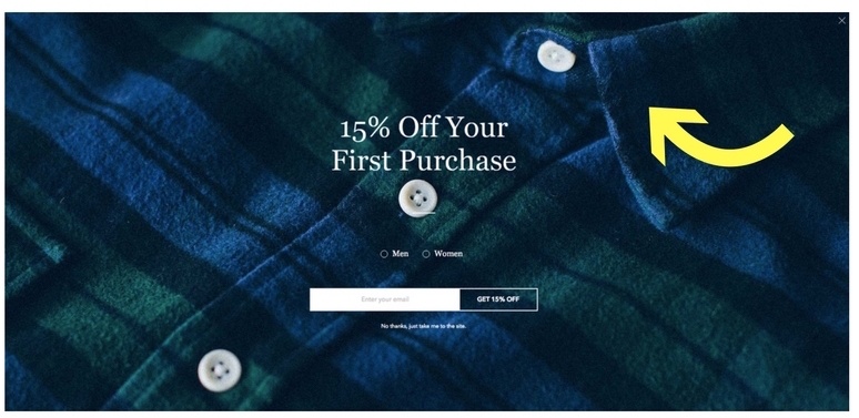
Perhaps our favourite popup of the bunch comes from Taylor Stitch, a California based brand offering classic men’s and women’s apparel.
Taylor Stitch’s popup works because:
We realise that all of the above examples serve the same purpose: to encourage a website browser to submit their email address and signup to the brand’s emails.
However, there are other ways retailers can make the most of popups. For example:
Cart abandonment
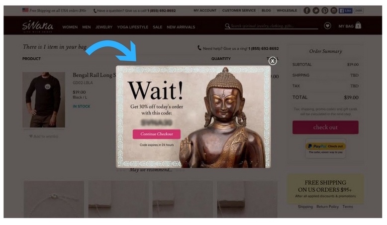
If your brand has an existing discount on offer for brand new visitors to the site, don’t be afraid to use an exit intent popup as a way to remind a browser who is about to leave their cart of that offer in a bid to tempt them back. The above example is from Sivana Spirit.
Nonetheless, we’d advise against creating a special abandonment offer, as it may encourage potential customers to hold out for a discount on something they would have paid full price for.
Two-step promotion
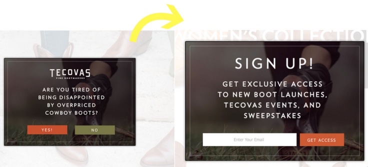
If you’re feeling particularly adventurous, including two different popups that are part of the same promotion can be an effective way to really engage visitors.
In the above example, bootmakers Tecovas hook a visitor in by identifying a potential pain-point and posing it as a question: “Are you tired of being disappointed by overpriced cowboy boots?”. Once a visitor has clicked yes or no, they are led to the second popup, asking them to signup for their newsletter. The subtext is that by subscribing, you will no longer be disappointed.
If you’re still unsure about whether or not to even use a popup for fear of high bounce rate on your site, it’s worth bearing in mind that 55% of traffic bounces within the first 15 seconds of a visit anyway – regardless of a popup.
As Grant Thomas from JustUno points out, the key is to worry less about bounce rates and more about the percentage of traffic that you are converting.
He said:
“Pop ups are conversion focused and here’s why. Most shoppers aren’t going to take action unless they are asked to or presented with an incentive to do so. Website pop ups prompt shoppers to subscribe to emails, visit specific pages, and ultimately purchase.
“Presenting shoppers with that next step to take is going to move each shopper down your sales funnel, which is the goal! Even if you have doubts, there is no harm in trying out a pop up for a week or two. You’ll be pleasantly surprised.”
We hope this blog post helps you on your quest to creating the perfect popup, and has given you some inspiration on how you can make this potentially disruptive marketing tactic truly useful.
To summarise, here are some things to try out:
As pointed out in the Shopify blog, you can also experiment with different ways to display your popups; for example, deciding whether to make it time-based, scroll-based or page specific.
Anything to add? Tweet us at @OmetriaData ![]()
Ometria is committed to protecting and respecting your privacy, and we’ll only use your personal information to administer your account and to provide the products and services you requested from us. You may unsubscribe from these communications at any time. For information on how to unsubscribe, as well as our privacy practices and commitment to protecting your privacy, please review our Privacy Policy.
Take the first step toward smarter customer marketing